HMD Global, under the Nokia banner, has been consistently churning out competitive phones. The Nokia X20 is another such competitively priced phone, with enough grunt and minimalism to be appealing to all.
Design and Build
The Nokia X20 is a pretty big phone. It’s quite hard to use one handed, and that is thanks to the big 6.67” screen and even bigger bezels.
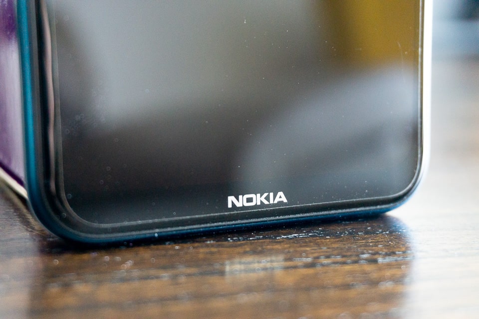
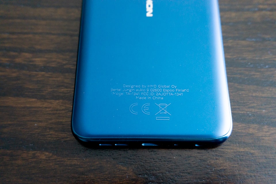
The phone is not very thick nor is it very heavy, it’s just that it has a huge presence thanks to those bezels. The bezel on the top and sides are the same size, while the bottom has a much bigger bezel adorning the Nokia brand.
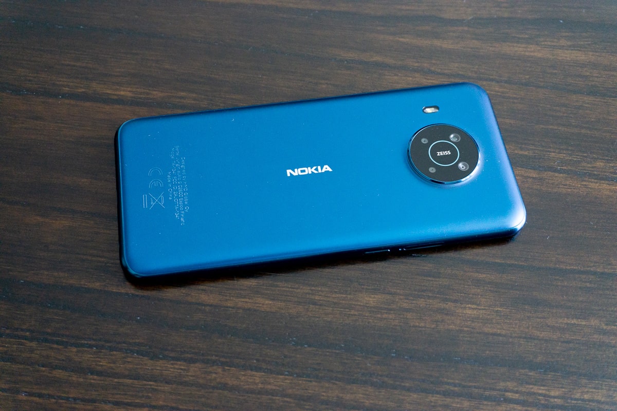
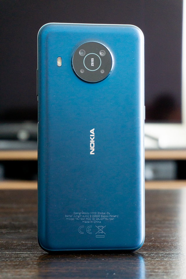
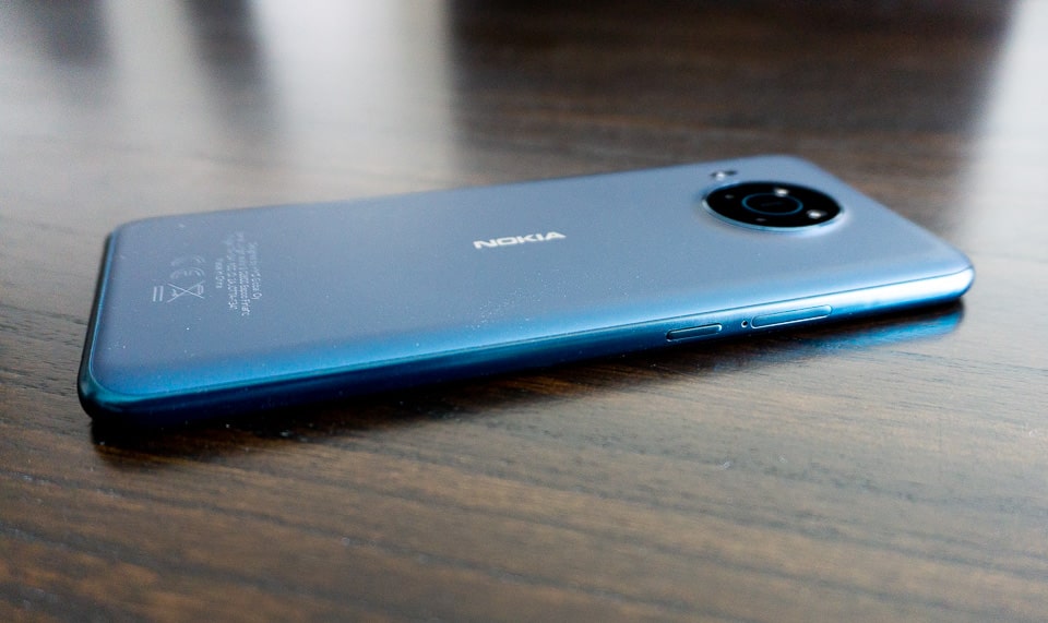
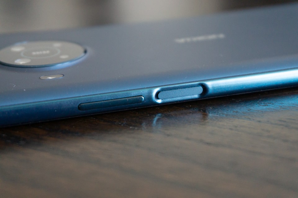
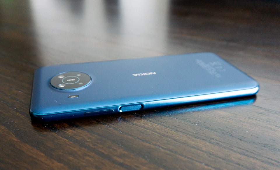
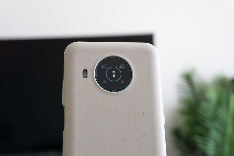
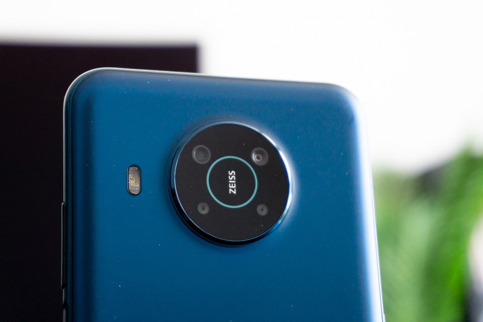
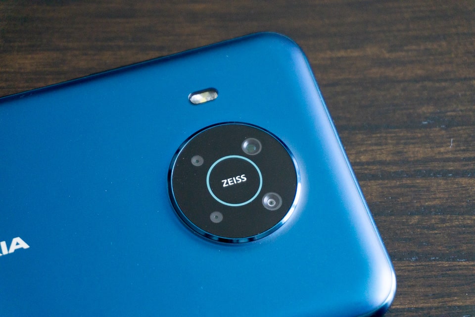
Once you get over the size you realise that the X20 is actually quite a nice phone to look at. The camera module is centred at the back, while the flash sits on the side. The power button doubles as a fingerprint reader.
The phone we got to review was the Nordic Blue version. The colour is really nice. It has a matte feel to it, and so doesn’t attract many fingerprints on the body.
The phone doesn’t actually look bad. The camera location and the colour scheme gives it a premium look. It’s a really nice looking phone. Just big.
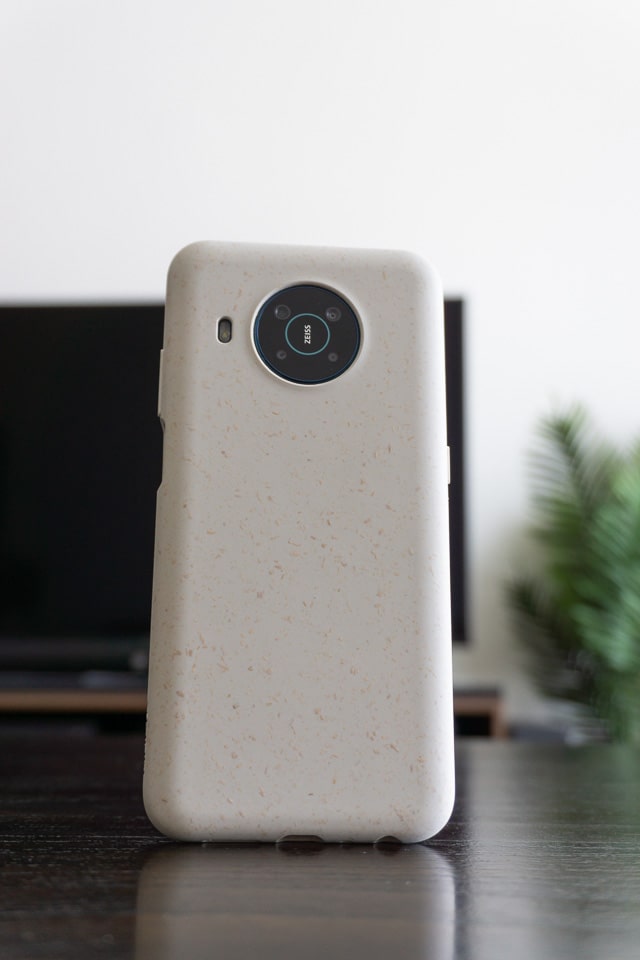
A case is included in the box, which has the look of pop-corn ice cream. Not the best of looks, but it is unique and it eventually grew on me.
Camera:
The Nokia X20 comes with 5 cameras. Here is the breakdown of all the cameras:
- 64 MP, Main camera – Wide
- 5 MP – Ultrawide
- 2 MP – Depth sensor
- 2 MP – Macro
- Front-facing: 32 MP
We have seen similar camera setups in other smartphones, so nothing groundbreaking here.
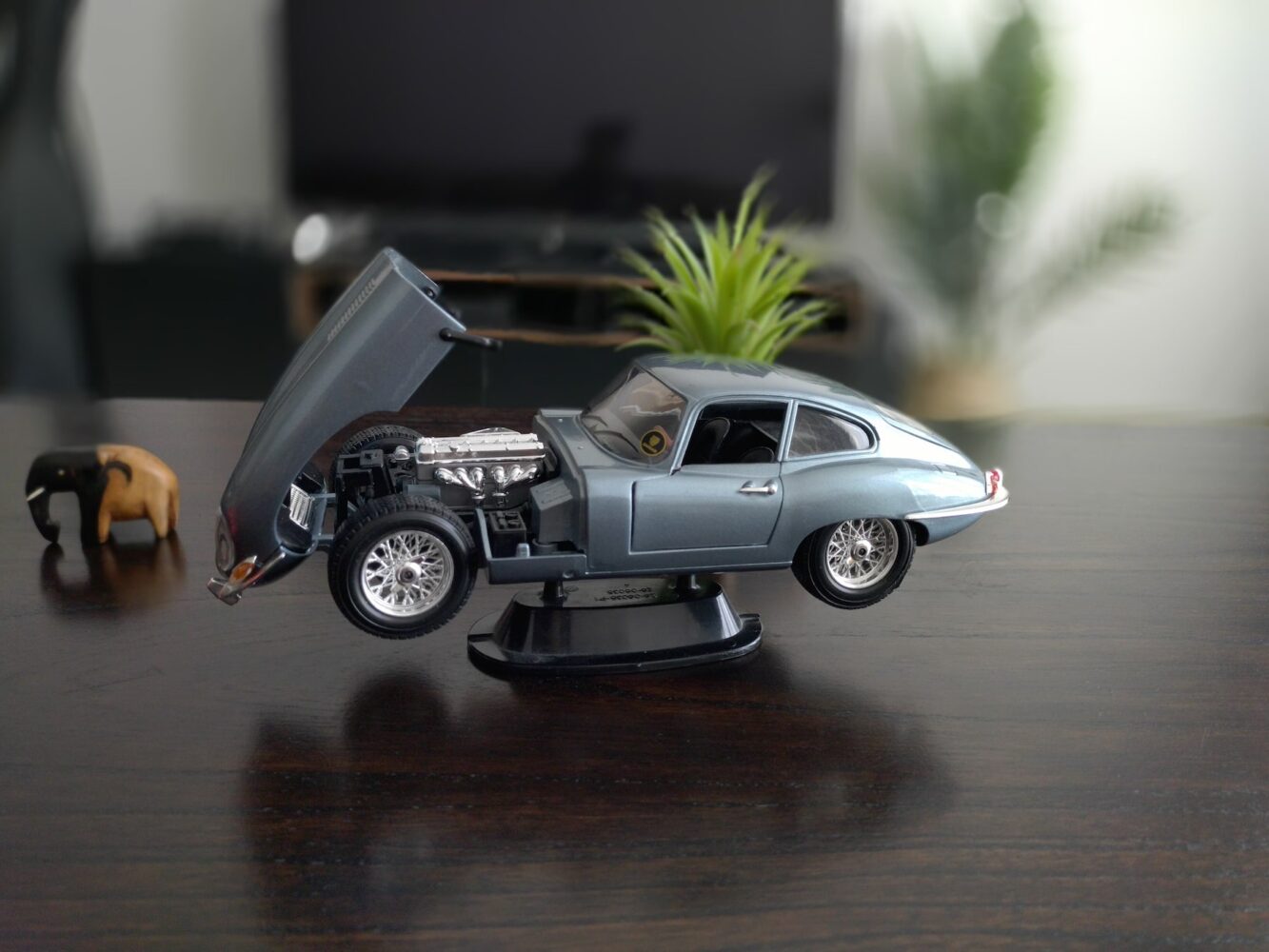
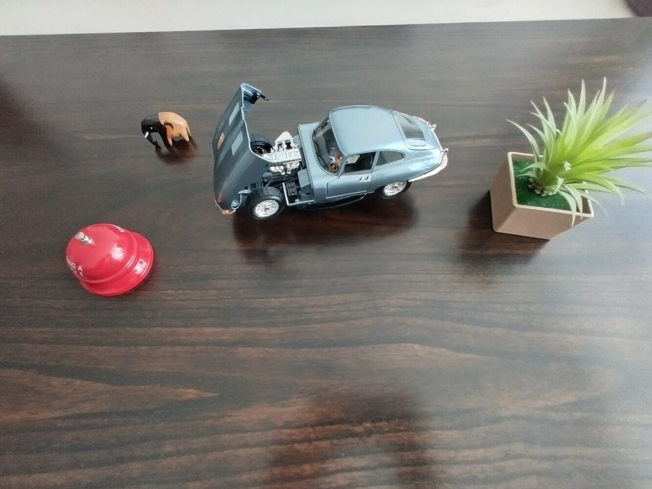
The cameras are quite average, the main camera can actually capture colour quite well, but it always seems to miss out on details.
A rather strange issue I faced was that the viewfinder didn’t always represent what the final picture would look like. For e.g. while taking a picture, it always felt like the pictures had blown highlights and super high exposure, but after taking the picture it actually looks quite decent. On another note, the pictures would sometimes come out too blurry even if the subject was well lit and the photo was taken while being still. It feels like you need to really wait for the picture to be taken before you start moving the phone.
Nowhere is this more apparent than when taking portrait shots. The picture you take, and what you end up getting are two completely different things. Maybe that’s because a lot of the effects are added in post-processing, but wow! I would not have any confidence in the pictures taken simply because this camera is like the box of chocolates that forest gump had. (Yes old reference, but works for me.)
All a bit of a strange experience.
You do get the usual Nokia features, like Dual Sight and the Pro mode, which is a great user experience but can you shoot with confidence?
There is also a Cinema mode that can record movies at 24fps with a 21:9 ratio. The files are recorded in H-Log format. This is a great addition and might just be the best use of the camera. This obviously only works in Landscape mode, and has a few pro bits of information as you shoot.
Display
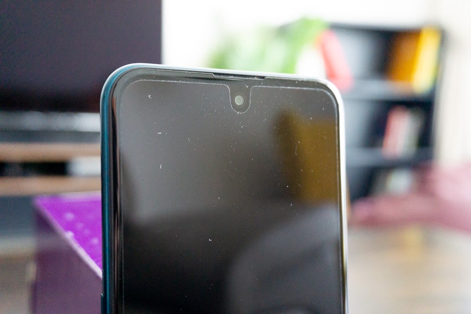
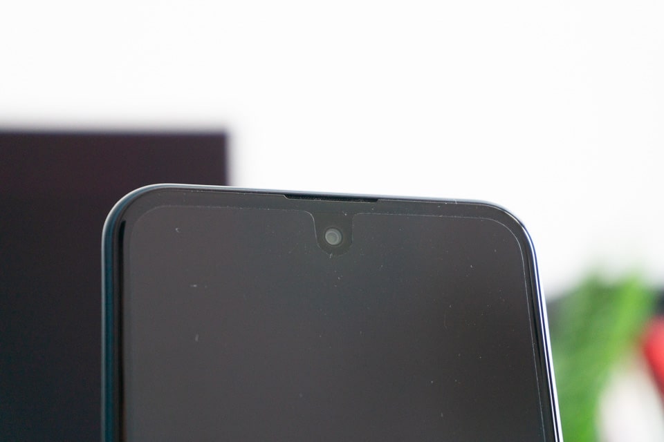
The Nokia X20 has a 6.67” IPS LCD display with a 1080 x 2400 resolution which gives it a pixel density of approximately 395 ppi. The selfie camera is a hole punch right in the middle.
You also get a screen protector pre-installed on the phone, right out of the box. This is a nice touch and as a person who uses screen protectors I appreciate the care.
The screen itself is decent, not the greatest screen on a phone, but it shows colours well enough and has decent blacks to boot.
The screen gets quite bright at 450 nits max brightness.
The viewing angles were not that great, and I did notice some strange discoloration around the selfie camera. This becomes especially apparent when looking at white screens, like the settings or a browser.
Battery
The battery in the Nokia X20 is 4,470mAh, which HMD claims is a 2 day battery. It says so on the box.
2 Days is a bit of a stretch, but then again I go through battery juice like a kid eating a softy on a hot summer in Dubai. Which means if you are conservative enough and don’t keep turning your phone screen on like an obsessed teen waiting for his crush to text back, then you should be able to get about 30+ hours of battery life from charged to almost-dead.
The phone charges via a USB-C connector, even though the port itself is 2.0. But there is no real fast charging as it’s rated at a max 18W fast charging.
Features, Specs and Performance
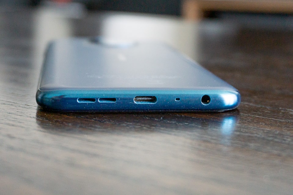
The Nokia X20 is a pretty standard phone in terms of features. You do get the headphone jack, which many phones have done away with. The fingerprint reader is part of the power button, and works really well.
You also get the USB-C port, but that’s really about it. There is not much else in terms of features that are out of the ordinary for a modern smartphone, budget or otherwise.
The specs of the phone are:
Processor:
- Snapdragon 480 5G Octa Code
- 2 x 2.0 GHz
- 6×1.8 GHz
- GPU: Adreno 619
RAM: 6 or 8 GB
Storage: 128GB
The model we got had 8GB of RAM.
The fingerprint reader worked really well, it is extremely accurate for a small module, even though it might be a bit slow. You can feel the delay between when it detects your finger and when the phone unlocks. It’s not too much of an issue. With the face unlock feature, getting into your phone is quite snappy overall.
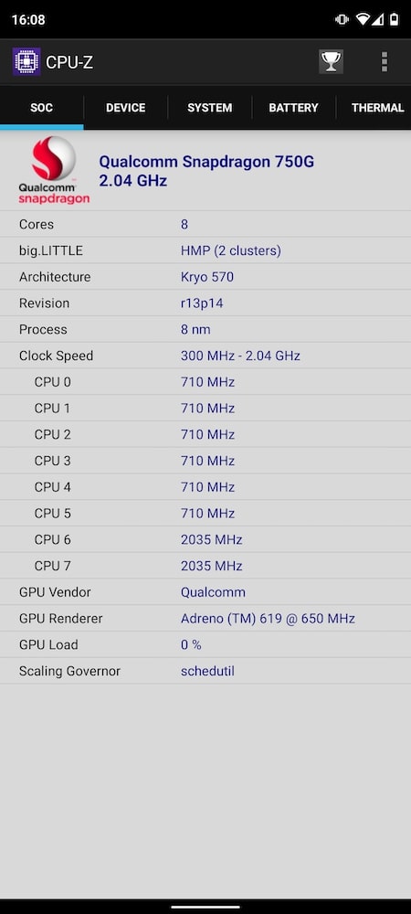
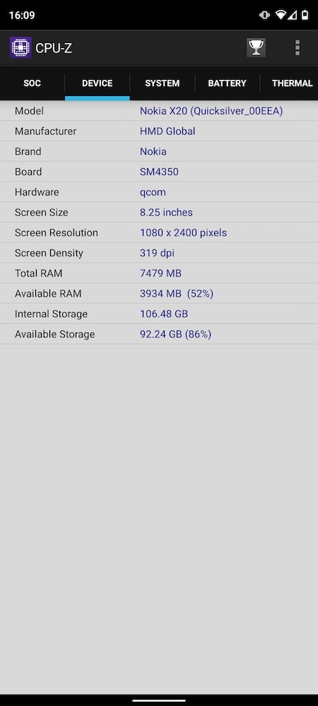
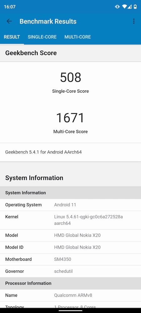
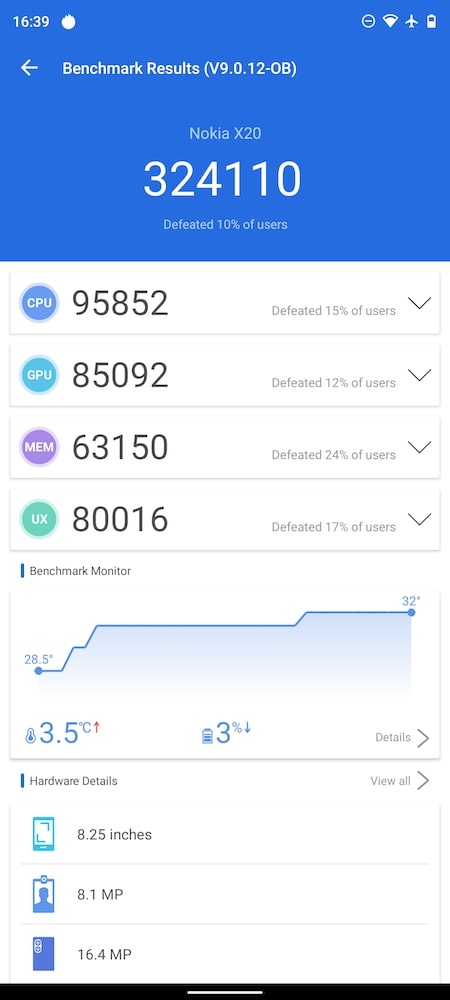
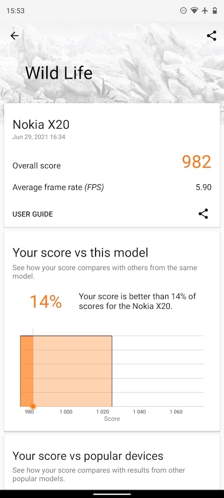
As per the spec sheet the phone has a mediocre Snapdragon 480, but based on the benchmarking software the processor is the Snapdragon 750G… I’m not sure who is right, but the phone’s processor is good. The benchmark scores are competitive and the performance while playing games and multitasking was perfect for a phone of this price range.
Here are the benchmarks:
Software
Nokia is part of the Android One program, which means that you get stock/vanilla Android with (almost) no bloatware on the phone.
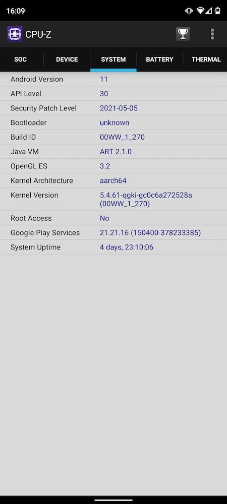
The Nokia X20 is no exception, you get Android 11 right out of the box with a promise of 2 years of updates (as per the Android One website). The box says 3 years of android updates, so here is another confusing message, but whichever it ends up being, it’s still great.
The phone came with stock android and no extra apps other than Netflix, Amazon and My Phone.
The first two are, for all intents and purposes, bloatware. If you don’t want to use either you can uninstall them, which is more than can be said about other phones.
The My Phone app is about managing your phone, seeing the stats and even contacting support. It’s a great addition and one I actually like to keep stored away for a rainy day.
The rest of the experience is just what you would expect. A stellar OS, with great functionality, control and that is breezy to use on a new smartphone.
The camera app also has the nice Pro mode like that from old Nokia (the windows era) phones. This is different from the stock Android camera’s pro mode, but it’s backed into the app and I find it to be the best pro mode user experience in any phone.
Quirks
While the phone has, what looks like, a huge ear piece on the top of the screen, you still only get audio from the downward firing speaker at the bottom. Why?
This was a huge missed opportunity because all that bezel without being used is such a shame. The cherry on the sad cake is that the speaker isn’t even that good. It distorts on high volumes and sounds like a budget after thought. While the speaker does get quite loud, you can block the speaker quite easily, thanks to its position. Again, all that space, why not use it?

