It’s been a rollercoaster few days for Sonos users since the new app dropped. On the surface, it’s a sleek redesign with quicker access to favorites and smoother device control. But dig a little deeper, and it’s like finding a worm in your apple (pun intended for Sonos Apple Music users).
The Good: Slick, Speedy, and Customizable
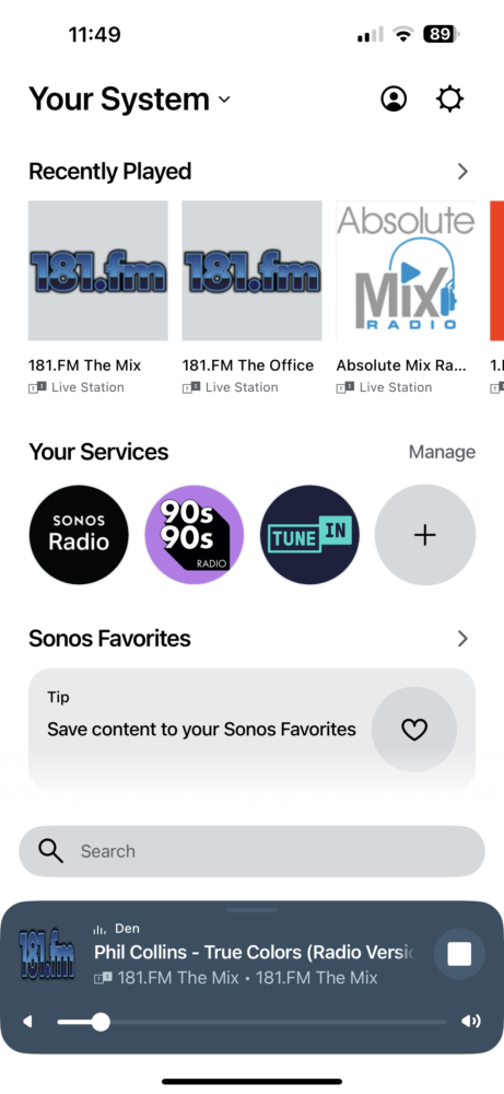
The new app is undeniably faster. Gone are the clunky tabs, replaced with a streamlined home screen that puts everything within reach. Managing devices is a breeze, and the app is much more forgiving of wonky setups (like my speakers tied to the garage lights… don’t judge).
Customization is another win. You can tailor your home screen to your liking, though sadly, you can’t reorder your streaming services. A small gripe in an otherwise personalized experience.


The Good highlights:
- Streamlined Interface: The new app ditches the old bottom tabs, making navigation more intuitive and bringing key functions front and center. Smaller thumbnails and a more consistent layout make browsing and managing your music a bit more pleasant.
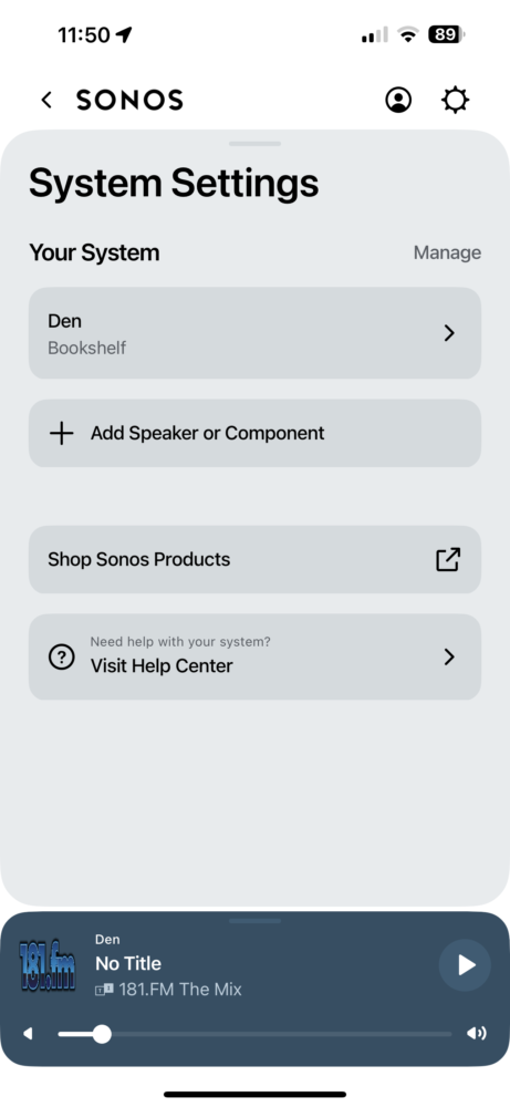
- Improved Device Management: Disconnected speakers are no longer a constant annoyance, offering a cleaner list of active devices for better control.
- Customization: Tailor the app’s home screen to your preferences, prioritizing the content and services you use most.
The Bad: Search Woes, Missing Features, and Accessibility Concerns
The new search function is a head-scratcher. It prioritizes streaming services over your own music library, making it a frustrating scavenger hunt. Plus, Sonos Radio is given prime placement, feeling a bit like a forced ad.
But the real issues are the missing features. No alarms, no sleep timers, and no ability to manage your play queue – these are not small inconveniences. For blind and visually impaired users, the problems are even worse. The new design clashes with accessibility tools, making the app practically unusable for some.


The Bad highlights:
- Search Frustrations: The new search function feels like a step backward. Grouping results by service rather than category makes it harder to find exactly what you’re looking for, especially if it’s not the top hit on your preferred platform.
- Missing Volume Indicator: The handy numeric volume display is gone from the main screen, relegated to the grouped speakers view. This seemingly small change has caused major annoyance for users.
- Missing Features: Alarms, sleep timers, and queue management options are inexplicably missing from the new app. Blind and visually impaired users are also experiencing major accessibility issues.


So, What’s the Deal, Sonos?
It’s baffling why Sonos would launch with so many obvious gaps. My guess? The rumored wireless headphones are looming, and they needed a new app architecture to support them. But did they have to sacrifice so many beloved features in the process?
The Sonos community is understandably upset, but I have faith they’ll listen and fix these issues. It might take time, but I believe we’ll eventually get the best of both worlds: a modern, sleek app with all the functionality we’ve come to expect.
In the meantime, it’s a bit of a bumpy ride. But hey, at least the app looks pretty while it’s misbehaving.


