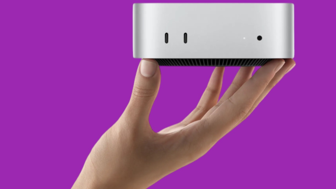
Apple’s new Mac mini, powered by the impressive M4 chip, has arrived with a whisper-quiet performance and a sleek, compact design. But amidst the chorus of praise for its technical prowess, a subtle design change has sparked a heated debate: the curious relocation of the power button. This seemingly insignificant alteration has left some users perplexed, while others openly decry it as a design flaw. Why has Apple, a company renowned for its meticulous attention to detail and user-centric design philosophy, chosen to move this fundamental control to a less accessible location?
A Design Enigma Wrapped in Aluminum
Apple’s design choices are rarely arbitrary. Every curve, every port, every button is carefully considered, serving both form and function. So, the decision to move the power button from its familiar position on the back panel to the underside of the device begs an explanation. Several theories attempt to unravel this design enigma:
- Internal Reorganization: The integration of the powerful M4 chip and the overall shrinking of the Mac mini’s footprint undoubtedly necessitated a significant internal redesign. Components have been miniaturized and rearranged, possibly leaving no room for the power button in its traditional spot. Relocating it to the bottom may have been a necessary compromise to accommodate this internal reorganization.
- Airflow Optimization: Thermal management is crucial for any computer, especially one as powerful as the Mac mini. By moving the power button, Apple may have optimized the internal airflow pathways, ensuring efficient cooling and preventing performance throttling. The button’s new location could contribute to a more streamlined airflow throughout the chassis, maximizing heat dissipation.
- Aesthetic Minimalism: Apple has always strived for clean, minimalist aesthetics. Perhaps the designers deemed the power button an unnecessary visual element on the otherwise sleek back panel. Moving it to the bottom creates a more visually unified surface, emphasizing the device’s minimalist design language.

The Usability Conundrum: Out of Sight, Out of Mind?
While the motivations behind the relocation remain shrouded in mystery, the impact on user experience is undeniable. Accessing the power button now requires users to lift or tilt the device, a seemingly trivial act that can quickly become a frustrating ordeal when the Mac mini is tucked away in a tight space or surrounded by a web of cables.
Imagine this scenario: You need to troubleshoot a software issue and decide to power cycle your Mac mini. It’s nestled amongst a tangle of wires beneath your desk, connected to various peripherals. Suddenly, that once easily accessible power button on the back panel seems like a distant memory. You’re left grappling with cables, contorting your hand to reach the underside of the device, and cursing Apple’s design team under your breath.
This seemingly minor inconvenience raises a larger question about Apple’s design philosophy. Has the pursuit of aesthetic purity come at the expense of practicality? Or is there a hidden functional benefit that justifies the added hassle?
A Question of Priorities: Form vs. Function
For users who rarely interact with the physical power button, relying instead on the keyboard or sleep mode, the change might be inconsequential. But for those who prefer a more tactile approach, who need to frequently power cycle their device, or who simply appreciate the convenience of an easily accessible power button, the new placement could be a constant source of annoyance.
This design decision forces us to confront the age-old debate of form versus function. Has Apple prioritized aesthetics over usability? Or is there a deeper logic at play, a calculated trade-off that we haven’t fully grasped?
The Verdict: A Design Quirk or a Design Flaw?
Only time will tell whether the relocated power button will be remembered as a minor design quirk or a significant flaw that tarnishes the Mac mini’s otherwise stellar reputation. In the meantime, the debate rages on, a testament to Apple’s enduring ability to spark controversy and ignite passionate discussions even with the smallest of design choices. Perhaps, in the grand scheme of things, the location of a button is a trivial matter.
A Personal Note:
Personally, I’m not entirely opposed to this change. While I understand the frustrations of those who find the new placement inconvenient, I also appreciate Apple’s commitment to minimalist design. As someone who rarely uses the physical power button on my own Mac mini, I’m willing to overlook this minor inconvenience in exchange for a cleaner, more streamlined aesthetic. Perhaps this is a sign of things to come, a glimpse into a future where physical buttons become increasingly obsolete, replaced by more intuitive and seamless interactions.


